back to the viz
Table of Contents
- Exec summary
- Background and motivation
- Inspiration: A great vis
- More inspiration: Narrative theory + machine learning
- Project objectives and goals
- Data
- Never mind: The big redesign
- Data 2.0
- An aside on theory
- OpenVis Conference 2016: Text visualization workshop
- Wrapping up
- Thanks
EXEC SUMMARY
First: Strange Horizons sci-fi stories haven't changed much over time. At least, not on the surface of things like vocab, sentence length, or award-winning-ness.
Second: I set out to tell a data-driven story, and ended up with a data exploration/re-imagined library catalog. So many sci-fi stories did I bookmark during this process!
Third: Text visualization is hard.
More stuff I learned:
- Prototype, prototype, prototype. I made the terrible mistake of discovering that my data was basically boring very late in the development process. Some tools for quick data exploration/prototyping: seaborn, matplotlib, the exciting Vega-Lite.
- Cleaning > Analyzing > Designing > Visualizing, in terms of time/mental energy. I definitely had it the other way around in my head.
- Natural language processing has enormous (awesome) depths. Yo, NLP ain't no joke. I naively thought text data would be fun/easy/novel (no pun intended) to visualize. Little did I realize what an analysis monster I would unleash. Hapax legomena, tf-idf, t-SNE, and the tinkering of stopwords. These things kept me very busy, much busier than I had originally expected.
- Data can't make up for design. I have a newfound respect for design. Especially elegant, intuitive, narrative design. The power of design! Tony Chu's OpenVis Conf 2016 slides really helped me identify why
the shape of textdidn't feel right. - Separate data collection (scraping) from analysis! I ended up building a Frankenmonster scraper that analyzed stories on the fly. This was incredibly inefficient. Next time, I'll maintain a clear line between grabbing all the data once, and then churning through it for analyses.
Background and motivation
The written word is one of our most important and rich sources of data; yet natural language analysis is a field mostly restrained to artificial intelligence and the digital humanities. Extending the tools of data visualization to natural language seems an especially interesting area to explore.
Kurt Vonnegut, The Shape of Stories (excerpt)
Inspiration: A great vis
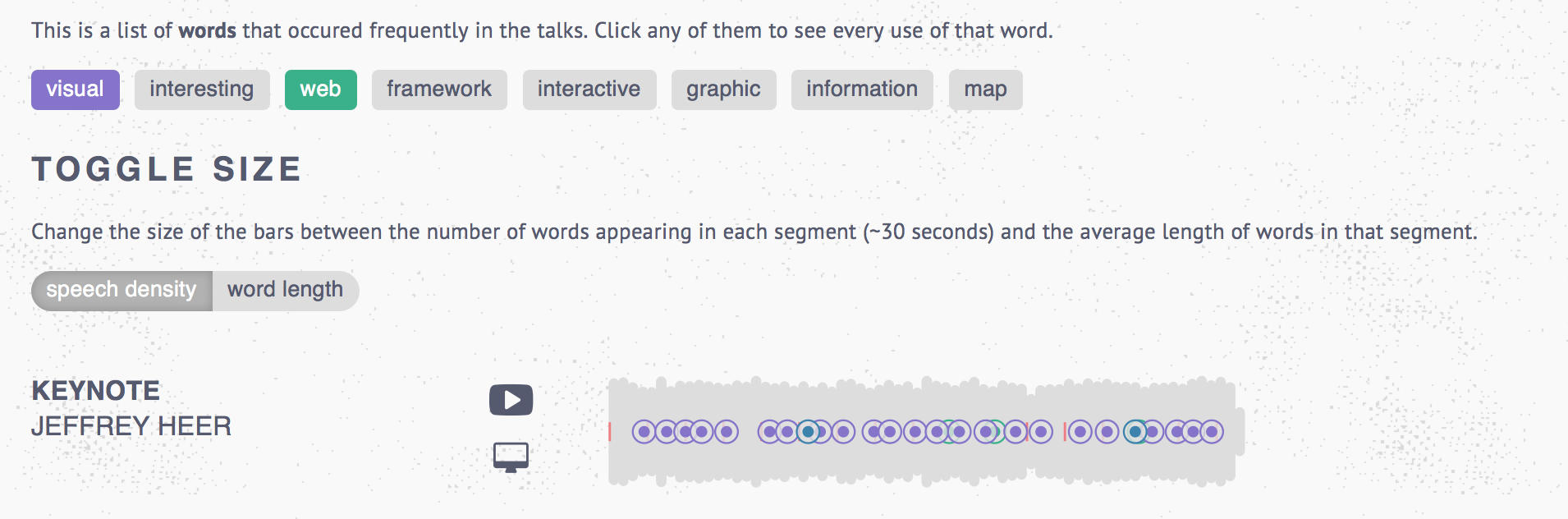
I was inspired by the OpenVis Conference 2015 video archive, which used an innovative visualization style to visualize the audio from all of the 2015 talks. Quickly, one could see the relative duration of the talks, how "dense" the talks are (or how long the words being used are), and how often certain words appeared. I fell in love with this visualization! My plan was to replicate and extend this idea.
More inspiration: Narrative theory + machine learning
Another related work was Kurt Vonnegut's lecture on "The Shape of Stories", and a data science project inspired by that lecture. In the lecture, Vonnegut says: "There's no reason why these simple shapes of stories can't be fed into computers." The data scientists at indico.io put this into action by applying sentiment analysis to Disney scripts, and then mapping those sentiments. The emerging "story shapes" were fascinating to see - especially since they resembled each other across films, indicating that there was a quantifiable "shape" to a story (or, at least, to the Disney story).
Specific questions I wanted to answer were:
- Do certain types of texts (e.g. novels, academic articles) have predictable "shapes"?
- In a novel, can we visually tell - using a visualization of the text, rather than the text itself - when a character enters, exits, or dies? Can we tell, from a visual gist, when an action scene is happening (short, abrupt sentences, lots of verbs) versus a scene setting description (long sentences, lots of adjectives)?
- Can we see a writer's style visually? For example, how complex their prose is?
Longer term goals would be to extend this to visualizing languages, more broadly, by examining the length of words, the length and structure of sentences, grammatical rules, and so on. Something to make Chomsky proud!
Data
The original source of data was Project Gutenberg. I started by focusing on a limited set of novels from Project Gutenberg. However, I intended to build something that would be easily adaptable to other texts.
I selected four 19th century novels as my initial text sources:
- Dracula, by Bram Stoker
- Frankenstein, by Mary Shelley
- Emma, by Jane Austen
- Moby Dick, by Herman Melville
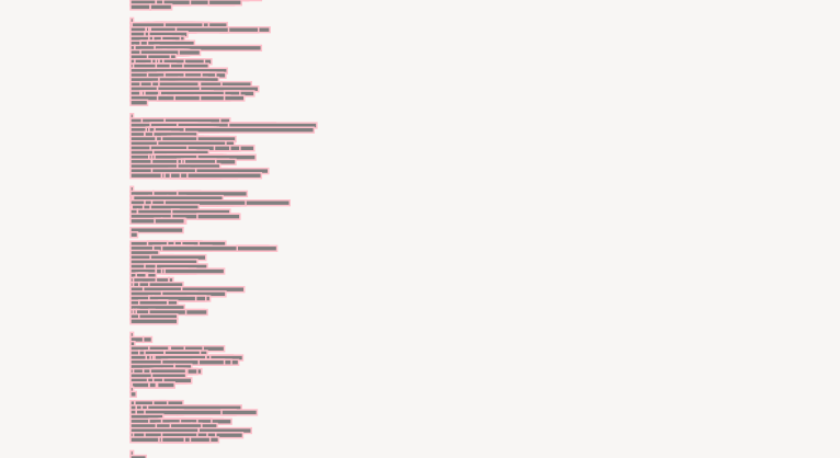
Early designs
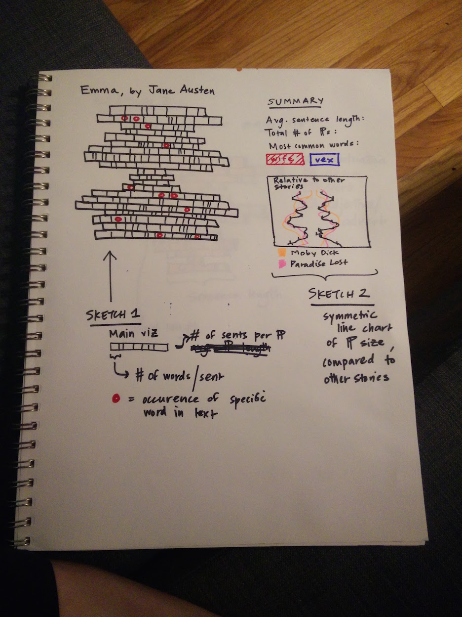
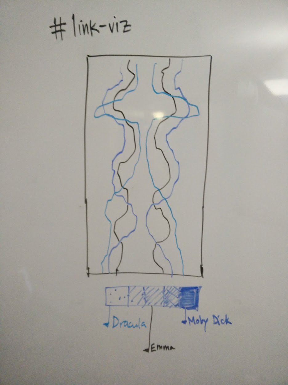
These four were selected because of their length (lots of data to visualize), their verbal complexity (high vocab counts), and their dual cross-cutting similarities (all 19th century, some genre overlap, gender balance) and differences (Moby Dick likely an outlier on a bunch of dimensions).
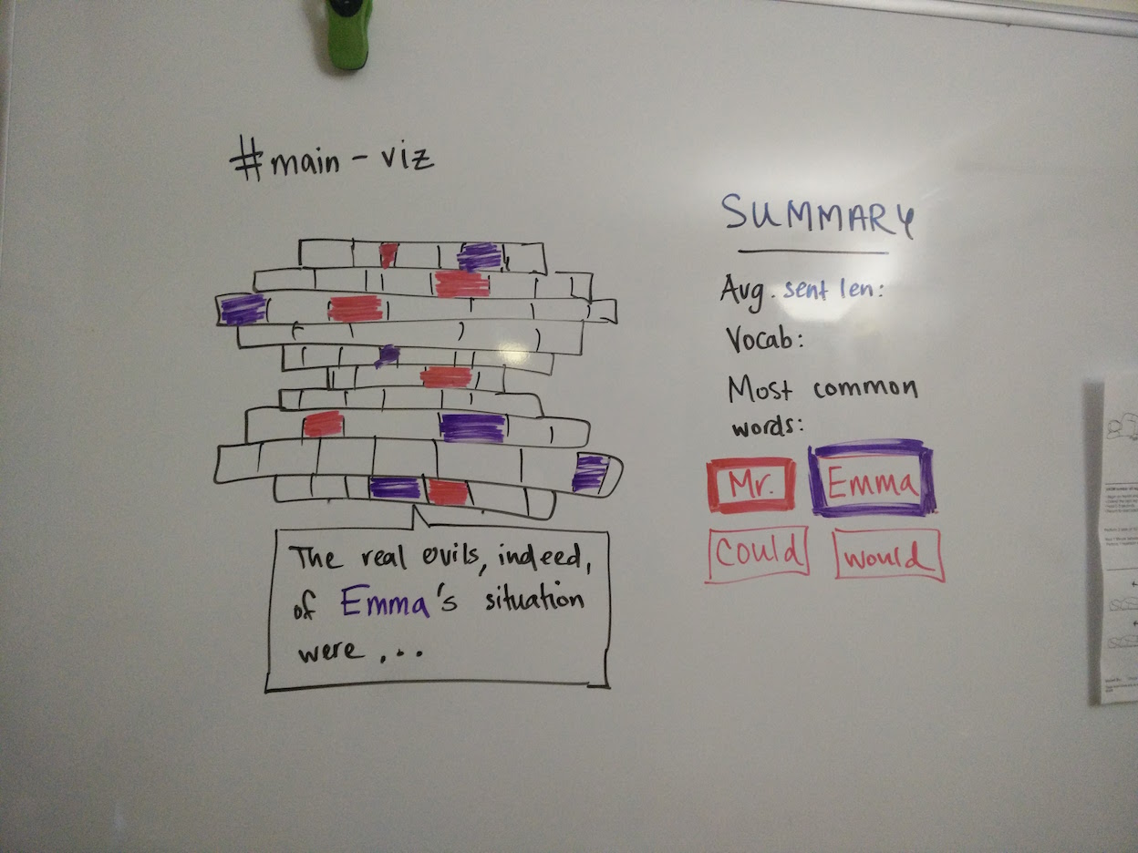
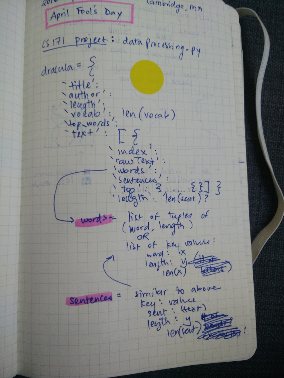
In Python, I used the Natural Language Toolkit (nltk) library to tokenize each text into words, sentences, and paragraphs; as well as to generate some basic descriptive statistics (for example, the size of the vocabulary). The objective was to create an array of book objects. Each book object would have top-level key-value pairs like title, author, top_words, vocab and wordcount. For example, for Emma:
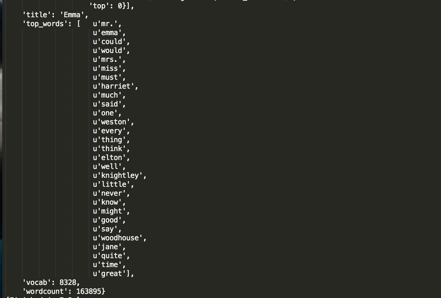
The top word is "Mr."! Feminism despair.
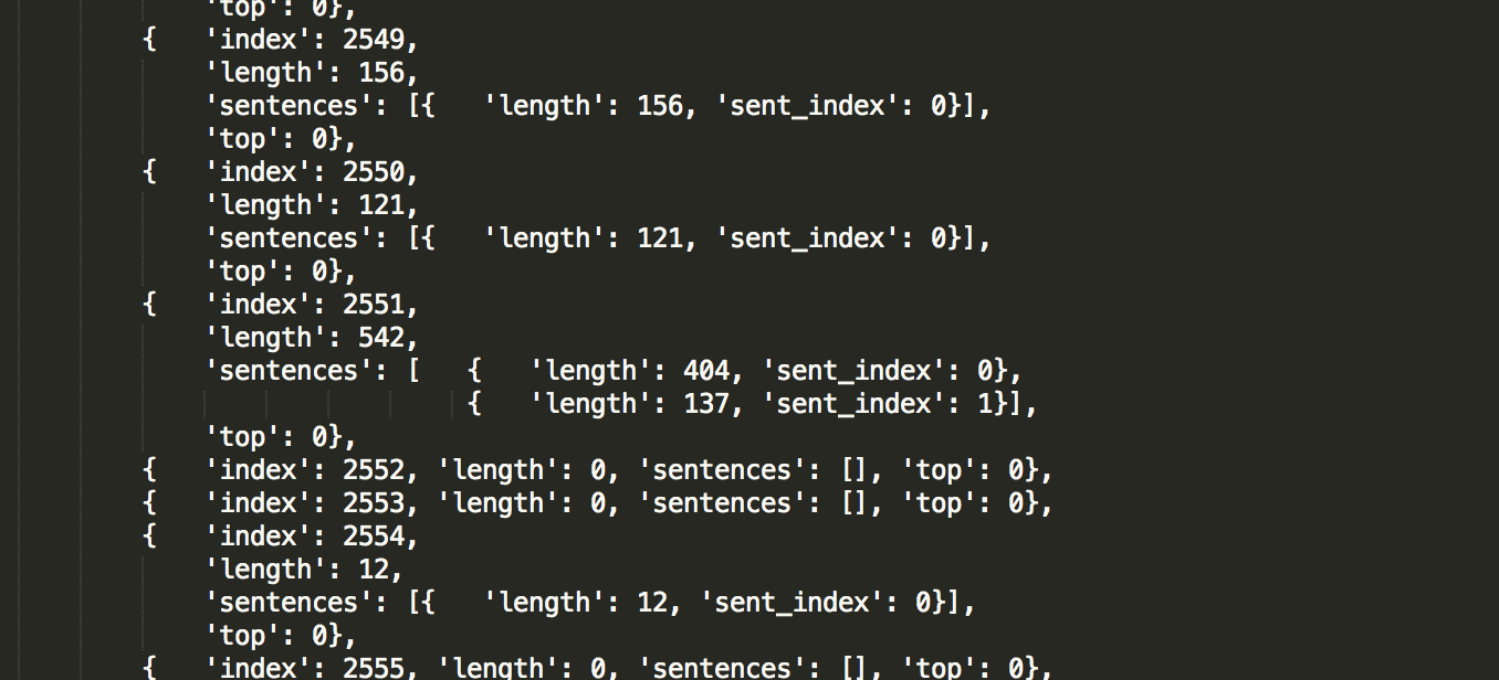
In addition, each book object would have a key-value pair, text, which was a giant array of all the paragraphs, indexed and analyzed for their length.
Here, the first challenge arose: including both the text and its natural language meta-data ballooned the file size up to 31MB. There were a number of attempts to bring it down -
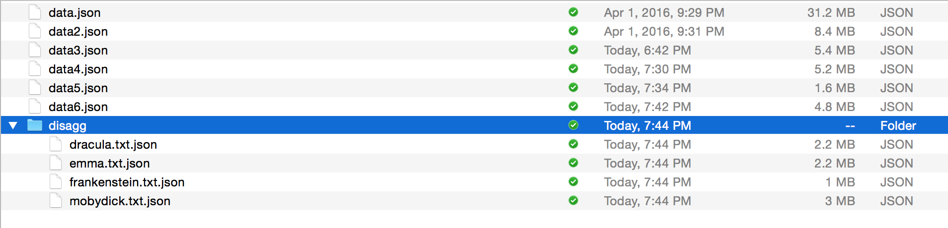 -- by removing duplicated text, or by removing text entirely, so that the
 text array in each book object became just a series of indexes and lengths.
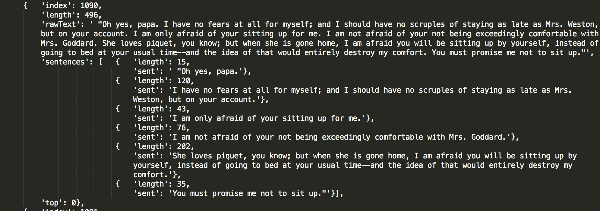
This seemed like a bummer, to be honest. What if users wanted to hover on any point in the viz and see the original text behind it? One compromise idea was to only keep sentences which had top words in them - allowing, at least, "top word sentences" to be displayed on hover. This didn't seem like a huge efficiency gain, though, since - by definition - many sentences would have top words in them.
Never mind: The big redesign
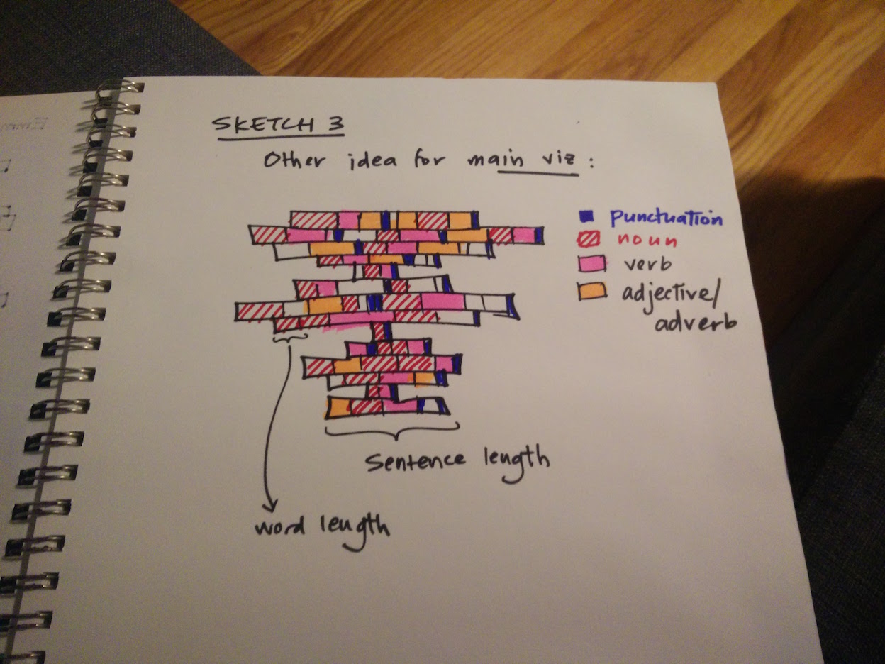
Following the CS171 individual vis exploration, the poster, and the expert evaluation, as well as achieving the first prototype of my original design, I decided to radically re-envision the project. While still concentrating on story shapes, I realized that visualizing paragraph lengths across 19th century novels was too similar to the immediate visual gist a user gets from looking at a text document itself. What additional value did my visualization provide?
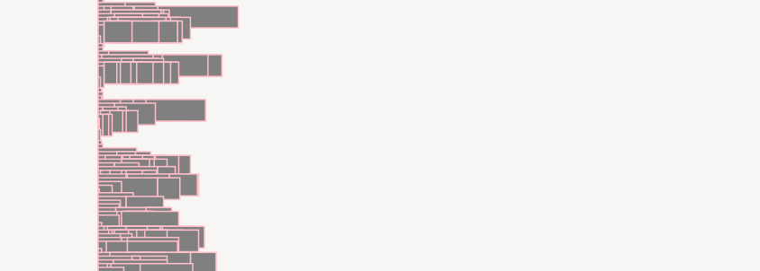
An early redesign sketch
Here are a series of the first inks on the page, as they took shape:
Very boring.
The original four books were simply too long and too intra-textually diverse for clear patterns to emerge. Users had to scroll for long periods over similar-looking terrain. It didn't seem to add much value beyond scrolling quickly through a text, as in a Word document or book.
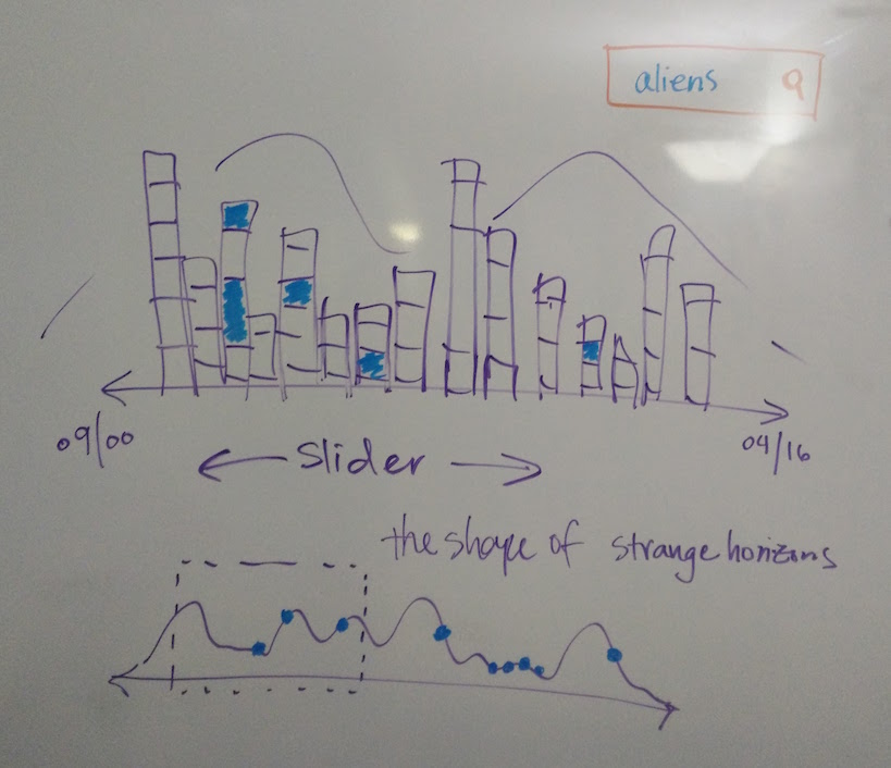
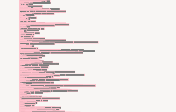
After several iterations, I decided to capture the same idea - the shape of stories - using a new design, and a new data source. (For more discussion on the data source, see Data 2.0 below). In this redesign, I would use the 700+ short stories available on Strange Horizons (one of my favorite online science fiction magazines) and analyze their complexity over time. Strange Horizons has published one story per week since September 2000 until today; that was a huge amount of data, and I had several ideas on how to visualize it.
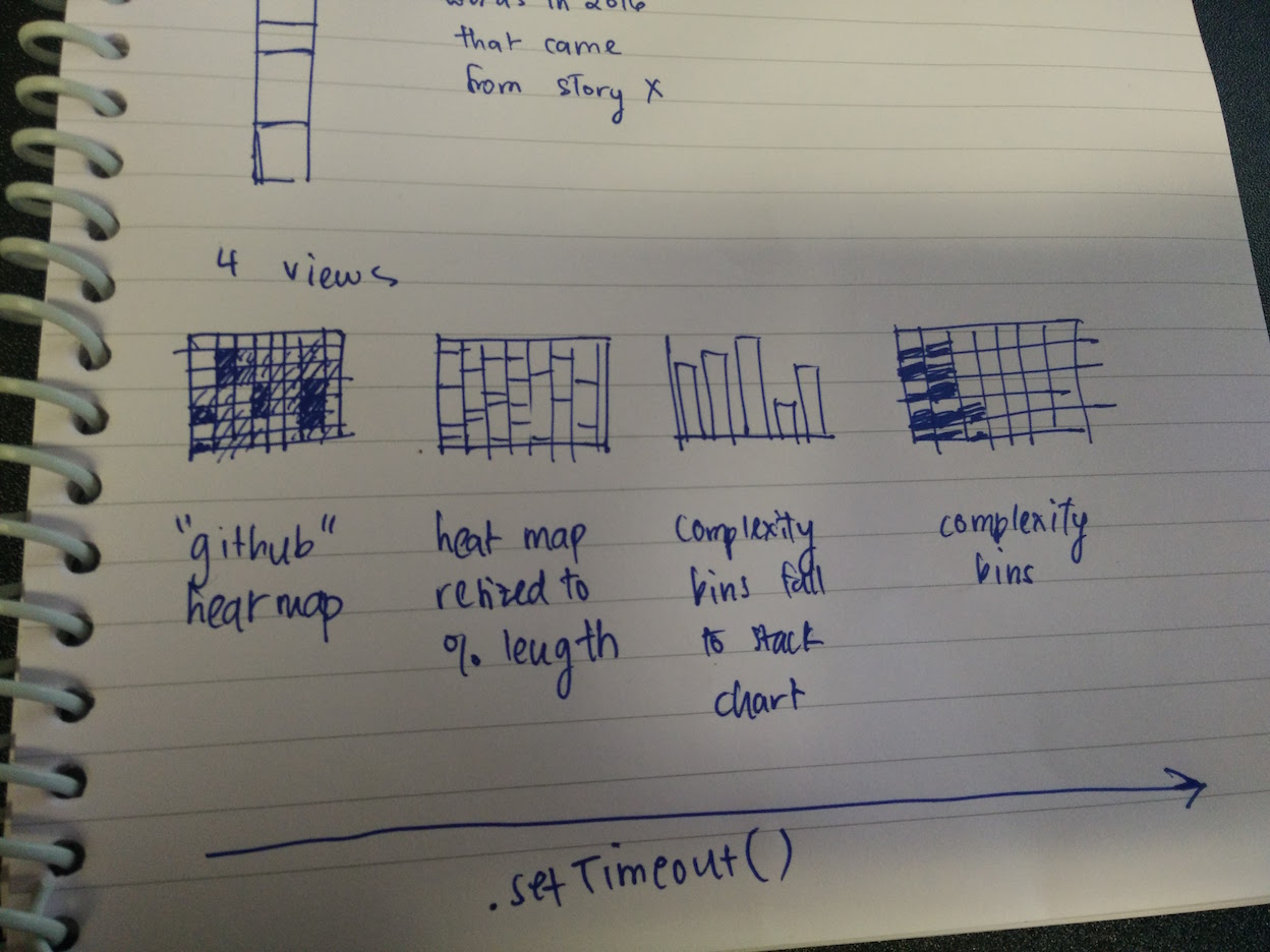
From the CS171 assignments of individual viz exploration, I was struck by the "literature fingerprints" idea in Keim and Oelke (2007) - this clearly influenced my idea of a GitHub-style heat map encoding a text's complexity (in my case, the unique set of words, or vocab).
Data 2.0
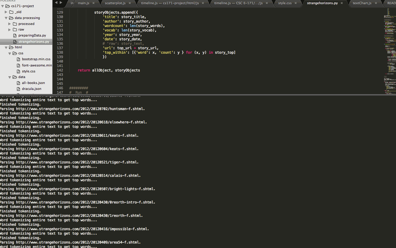
Following my redesign, I needed to scrape all the stories available on Strange Horizons since its launch in September 2000. I followed the same process as above, using BeautifulSoup to parse the Strange Horizons website, and nltk to tokenize the text and calculate basic summary statistics.
An aside: My pride and joy...
I also calculated the mean length of sentences, as well as the standard deviation of sentence length, for each story. This was to test the hypothesis that better writers vary their sentence lengths more. And those stories which had, for example, both high unique word count (vocab) and high sentence length standard deviation would be potentially very good. I also calculated the Automated Readability Index (ARI) (ultimately not used), inferred author gender (not used), and noted whether stories had won any awards.
An aside on theory
Beyond my personal interest in narrative structures and writing (science) fiction, as well as my data analytics background, I did not have any guidelines on what a meaningful natural language analysis would look like. In a way: this was a powerful learning experience. It allowed me the space to think creatively about which quantities made the most sense.
For example, when comparing the unique set of words in a story (vocab) across all stories, I decided to normalize it with vocab_demeaned. vocab_demeaned was calculated by dividing the unique set of words in a story by the story's total wordcount - giving a value between 0 (words never vary) and 1 (words always vary). This already had interesting implications: low scores indicated repetitive writing, high scores indicated potentially esoteric writing (and, in science fiction, that usually means strange names!). I realized it had another interesting interpretation: it was the likelihood that, at any given point in the text, the next word would be a new one.
Another normalization issue came up when comparing sentence lengths. If I hypothesized that "good" writers varied their sentence lengths more, I needed to calculate the standard deviation of sentence lengths within stories. But how could I compare those standard deviations across stories? I would need to normalize that too: and thus, for each story, I divided the standard deviation by the average sentence length. (This felt similar to using percent change in standard deviations as a standardized way to compare effect sizes across impact evaluations.)
I later learned this calculation is called the coefficient of variation.
The Bocoup rooster, now proudly adorning my laptop.
OpenVis Conference 2016: Text visualization workshop
On Sunday, April 24, I attended the Text Analysis and Visualization workshop, hosted by Yannick Assogba (@tafsiri) and Jim Vallandingham (@vlandham) of the open web design firm, Bocoup. I learned about several considerations in natural language processing: e.g. tf-idf, and k-means clustering. I also shared my project for critiquing with two UX experts. It was very helpful.
My list of TODOs, then, following the workshop:
- Bring all user functionality front and center. Make it clear and intuitive.
- Make sure everything can be seen at once - this involves a trade-off of visualizing all the data, versus showing a higher-level, abstracted, and simpler viz.
- Add more editorial commentary: which stories won awards? Which stories are more or less readable?
Wrapping up
I learned several lessons while building this project. I learned, for example, how critical it is to finish a robust data cleaning and analysis prior to any prototyping. I also learned about the value of prototyping: I would have saved many hours if I had, for example, prototyped a few of my visualizations before building them out fully in d3.js. (For example, I built a scatterplot comparing vocab with the standard deviation of sentence length within stories. The points appeared randomly distributed and - after tinkering with zoom interactions and finding no clear story - I removed it from my final layout, in favor of a cleaner, more linear story.)
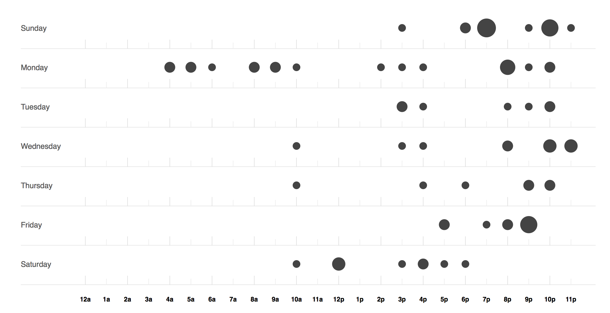
How hard I was working, according to my GitHub punch card.
Two-minute project screencast
Thanks
Thanks to the following people who took the time to give me helpfully critical and critically helpful prototype advice: Vikjam, Yannick, Lauren, Marsha, Jane, Eric, Alex, Doug, Leah, Michelle, Christopher, Chris, Isaac, Michael, Kalli, and Sol.
Thanks to the CS171 Spring 2016 team - especially Hanspeter, Zona, Hendrik and Johanna.
And thanks especially to Max, who had a lot of patience.
back to the viz